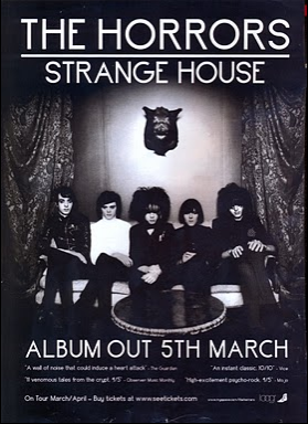
At the top we have the name of the band in bold letters to that it catches the readers attention.
It features the name of the album being realised which is good as the target audience knows what they are buying.
It also has the date of release so people know when the CD will become available.
The advertisement also features a few of the songs that will be included in the album which is good as the audience know what to expect.
The image itself is very dark as it is meant to represent the style of rock music this group follows which is good as by seeing this the audience will know what type of stuff to expect.
This advertisement is very conventional yet again, it features at the top of the page the name of the band which is good so the audience can quickly see who this band is. What also makes this good is that it tells us where you can buy this CD from in the bottom left corner so we know where we can go to get it. In the same corner we also see the label this band is under which is good as their contracted to each other so it helps get their name further out there. The advertisement also features a date of release so that people know when it is to become available to the public. Finally we have an image on the poster of the band which appears to be of them preforming live which is good also as it is a good link to what the CD is off.

This advertisement of The Horrors is good as it shows the name of the band at the top in the middle of the page along with the name of the album, the date of the albums release and finally the record company they belong too.
We then have an image of the band together in the middle of the page, this is good as their target audience can recognise them and also from seeing the type of clothes they wear and the colour usage we can make a good guess on the style of rock they are part off.


No comments:
Post a Comment