Artist names: Arctic Monkeys
Artists image appears on the front cover
Camerawork: Close up the artist. He appears to be starring right at the viewer. It is an important for the artist to be on front of the cover so that they can be recognised by the viewer.
Mise en scene: On this cover we see the artist smoking, this can tell us a lot about the style of the music as smoking is considered to be rebellious in a way.
The cover is in black and white which could tell us they of an old styled rock music.
The background looks to be curtains so this may indicate that they are be stage performers.
Mise en scene: Performance- The artist on this front cover has quite a closed body posture. He takes up most of the frame, he also has dreary eyes in this shot, because of all this it gives him quite a cool look that makes him look as if he is in control of everything around him
 Camerawork: On the back of the cover we have yet another close up of the artist, this time however the artist is not looking straight forward and instead has his head in his hand. We do not get any further information from this shot as it still uses the same shot type.
Mise en Scene: Performance-- The lead singer had a concealed body posture similar to the the font cover however his head in in his hand this time, this is very common for a rock album cover as they try to come off as cool and as if they don't care that a camera is their, they seem more authentic compared to a pop cover where they all try to look like their having fun which looks fake.
The background remains very similar to the front with the curtains in the background.
We also see on the back the track list to the album so that the audience knows what songs they are going to be getting with the album.
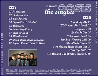
Artists name- Oasis
Artists image appears on the front cover.
 Camerawork- We are shown a low angle shot of the rock band which appear to be performing on a stage with the equipment in the background, unlike the first front cover from the Artic Monkeys this artist doesn't look into the camera so the connection is not being made with the audience in the same way but he is still on the front cover which is important so that he can be recognised by the target audience.
 Mise En Scene- In the shot we have all of the members in the background playing their instruments, this is a common thing for a rock band to do as they want their style of music to be put out so the audience knows what their going to get and also as they are a band they want every member on the cover as their a team in a way and all should be recognised for thier talent. Their body posture is a lot more open which suggests that their music is expressed more freely and that their not shy of a big audience.
 Mise En Scene- On the back of the cover we have the same conventions as most other albums, these being that we get a list of all of the tracks in this album along with a picture of the band to show again who they are to the audience so that they are recognised. In the picture however not ecer member looks at the band which is again very common for a rock band to do. The background colour used in purple which helps the text pop a lot more and also allows the picture to stand out more as they are wearing fairly dark clothes in a dark background, the lead singer however of the band in in a light blue whilst the others are in their dark coulours, this is so that he stands out and people will know just by seeing this that he is the lead singer.
Their is little camera work on the back cover as their is only the one shot, however a medium shot is used so that all of the members are seen and we can see a fair bit of them, this is important to have them in a shot type like this for the cover because they can be easily noticed and recognised by their audience.
Artist name- Kaiser Chiefs
Mise En Scene
In this front cover we have every member of the band appear clearly on the front cover with the lead singer in the middle. it is important for the artist to appear on the front cover so that the audience can easily recognise them. The album cover follows the conventions of a typical front cover as it also features the name of the group which is imporant so people know who they are along with the name of the album, they use a faded yellow type colour which makes the cover look old, this could tell us that their style of music is of old rock and not what people are hearing today, that they have stuck to the roots of the genre.
Cinematography
We have a medium close up of the band on the front cover, this is good as it allows them to be easily recognised by their audience. They all stare into the camera which is fairly unual for a rock band cover but because they do this it allows them to make a connection with the audience which is a good thing.
 The back of the cover sticks to the conventional items you would see on the back cover. It features a list of all of the songs on the back so the audience knows what they are getting, it also has all of the record labels that the band belongs to. The colour on the back maintains the same colour as the front with the same style font which reinforces the point that this could be an old school type of rock band and not like all this new stuff coming out.
No comments:
Post a Comment